Tasigna: Turning the Tide on Symptoms
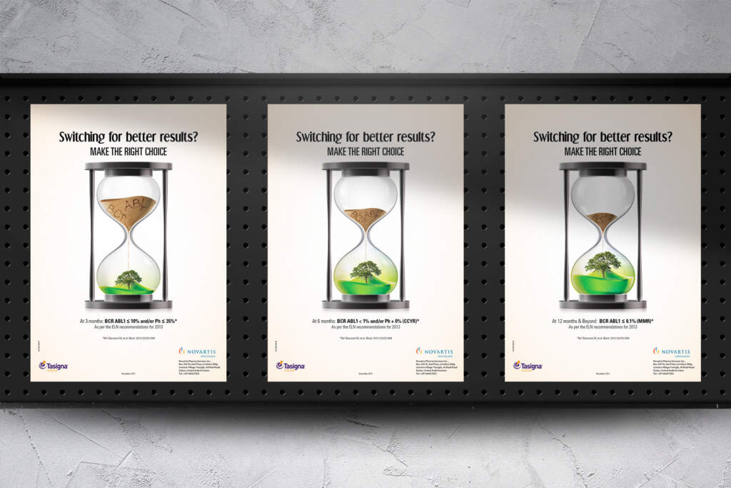
Our poster design for Novartis Tasigna Medication revolves around the metaphor of an hourglass to convey the transformative journey and hopeful outcomes associated with Tasigna treatment.
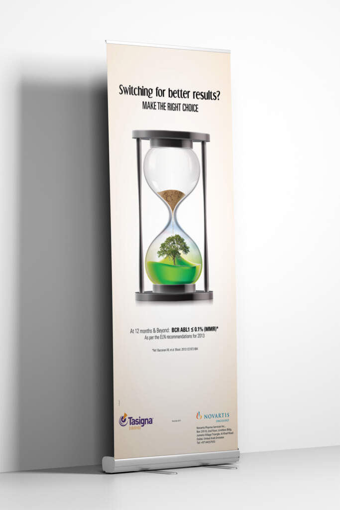
The hourglass serves as a dynamic canvas, divided into two halves. The top half is filled with grains representing symptoms, visually connecting with the challenges faced by patients. As time progresses, symbolizing the Tasigna treatment timeline, the sand descends, and the once-dominant symptoms gradually fade away.

Visual Elements
The sand watch takes a central stage, its structure divided into two halves. The upper portion of the hourglass is initially filled with three distinct hues of sand, each representing a specific phase of the Tasigna treatment process.
- At 3 months: The sand color corresponds to the first phase of treatment, symbolizing the initial steps in mitigating symptoms.
- At 6 months: A transition in sand color marks the second phase, signifying progress in the journey towards improved health.
- At 12 months: The final sand color represents the culmination of treatment, where the patient’s BCR-ABL % or level is ideally < or = 0.1%, reflecting the positive impact of Tasigna on their health.
A key feature involves the incorporation of special effects. The letters representing the illness are strategically disintegrating, symbolizing the dissipation of symptoms and indicating that the challenging times are over. This effect reinforces the message of Tasigna’s efficacy in overcoming the illness.


